Choose the Right Chart to Represent your Business Metrics
OK, so you have implemented some sort of sales management system such as a CRM and your sales team has been using the system for some time, entering loads of useful data that you can start using as 'metrics' to measure how your business is performing...
How can you consolidate this data though? How can you publish it in a corporate wiki to shareholders or team members? How can you consolidate the most important data into meaningful dashboards?
Typically the best option is a 'BI' (Business Intelligence) solution, which will allow you to import your data then 'slice and dice' reports and charts as you go, drilling down in real time where required. Better still, this BI software would synch automatically to your CRM such as Zoho Reports does with Zoho CRM.
Once you have the solution in place though, what kinds of charts should you use for the various types of data that you are collecting?
Zoho Reports is the versatile online business reporting app from Zoho and we love it!
Zoho Reports allows managers and business owners to get an in-depth insight into business operations.
It provides functions to upload or synchronise data such as company spreadsheets or data from other traditional applications and then quickly and easily create fantastic looking reports and charts using a drag and drop interface that can be published on intranets or share holder reports or even displayed in company blogs or war room type scenarios!
When we first started using we used to pretty much us pie charts , block graphs and sometimes the line charts for trends but after a while we tried to use more of the many chart types that are available to in the business reporting solution, such as: stacked bar chart, scatter chart, funnel chart, web chart, area chart and the combination chart.
By using different charts for different types of reports we found that the data can be better represented giving you a better insight into your overall report in just one glance.
However, when using them with customers we often encountered some confusion on what the other, less ‘popular’ or less well known charts are for, and found ourselves going through the entire learning process from scratch on what each chart does and what chart is best in what reporting scenario.
Zoho Reports now synchronises seamlessly with two other popular Zoho business solutions - Zoho CRM and also Zoho Projects, so choosing the right chart to represent your data is now even more important.
Below is a brief insight into the charts that are available and how they might be best used in different business scenarios.
Column/Bar Chart
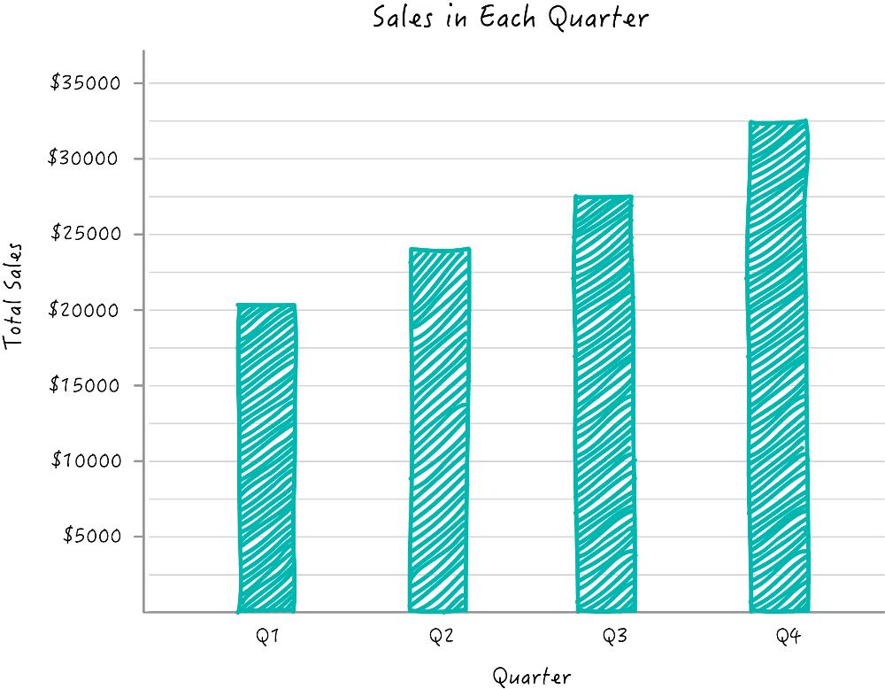
Zoho Reports has two type of bar charts available; vertical bar charts, which ar best when comparing different groups of data, say between 2-7 sets; and horizontal bar charts, which are best for comparisons between 8 or more sets of data.
Bar charts are useful when the data sets, or groups of data, along the x axis, are ‘mutually exclusive’. This means multiple ‘instances’ that cannot occur at the same time, for example - sales by day, sales by week, sales by month; or for example fields with one of a few options, say selected from a drop down menu or something similar, such as sales stage, next step, etc. where the answer can be only one of the options.
Stacked Column/Bar Chart
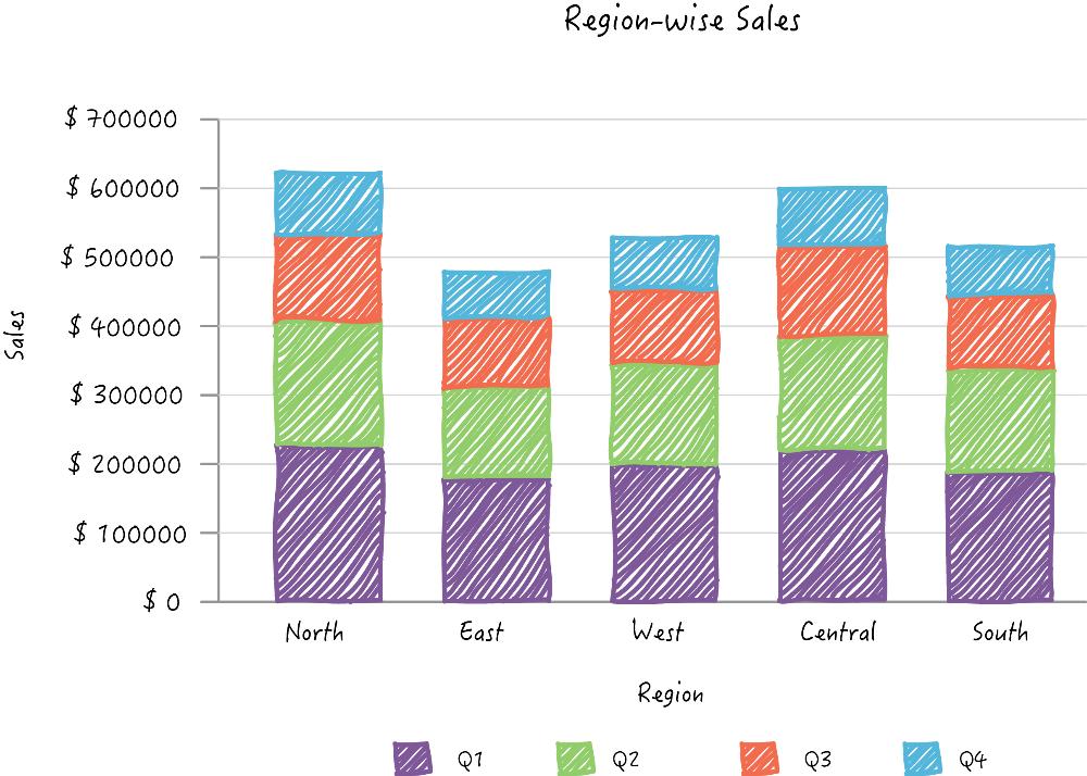
Stacked bar charts are similar to the above but are useful when data sets have to be broken down into their individual components and also you want compare the total of the data sets with one another. For example use stacked charts when you want to chart monthly sales across a line of products.
Combination Chart
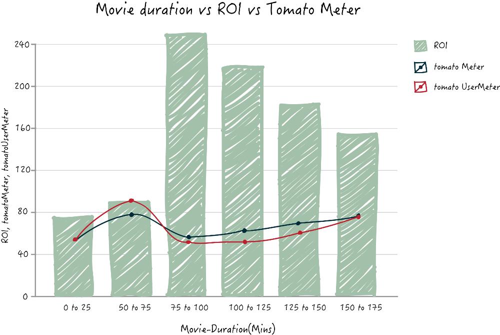
The combination chart is - as its name suggests - a combination of multiple types of charts, in this case a bar chart and a line chart.
The combination chart is best used when there is a large variation in the data sets or when there are mixed data sets, for example if there is a large variance between forecasted sales and actual sales.
Pie Chart
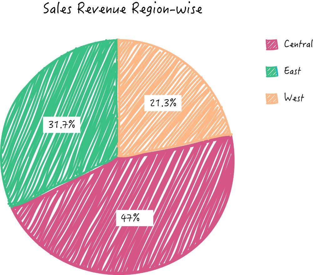
The pie chart is one of the most popular charts around and is best used when you want to demonstrate differences within segments of a group of data. For example, total revenue generated by sales person or sales by region.
Ring Chart
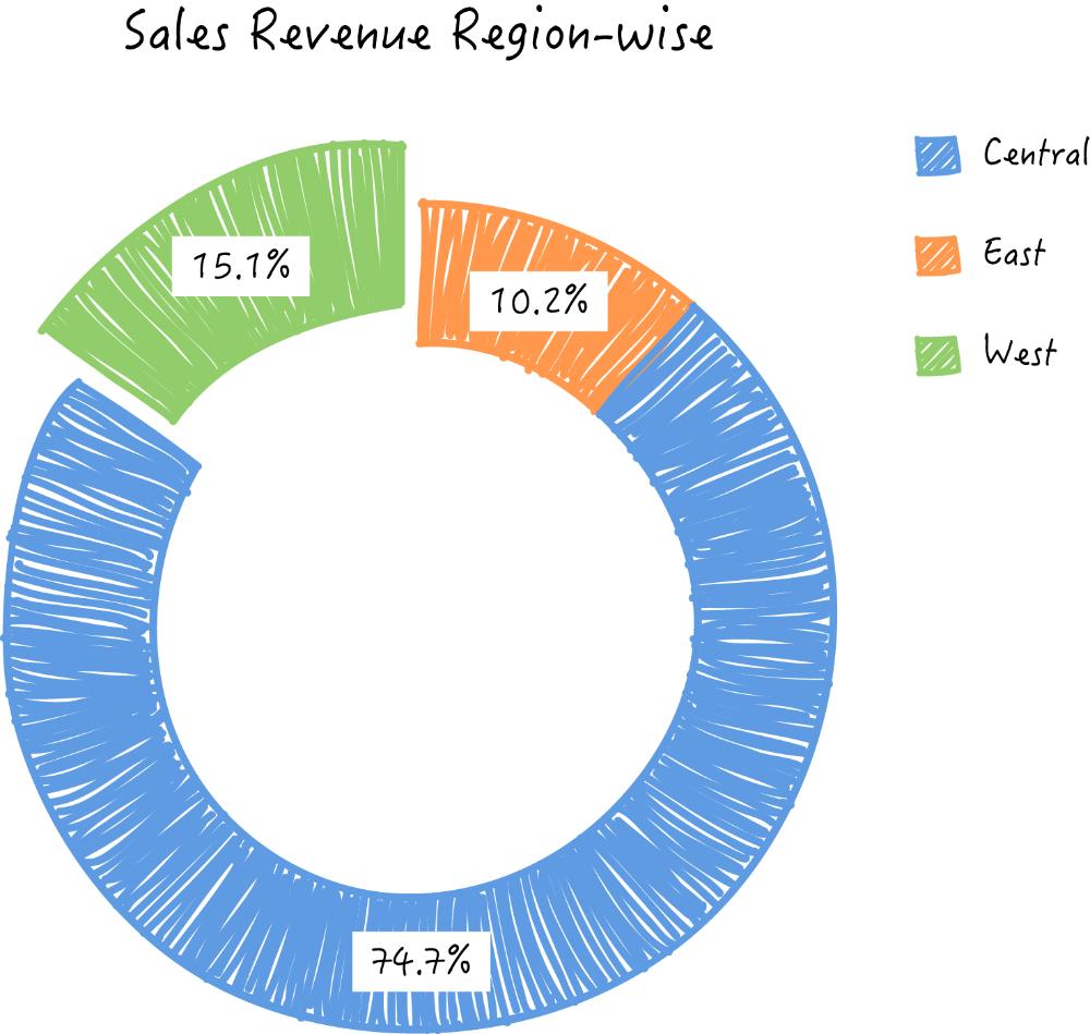
The ring chart, also known as a donut chart, has the same function as the pie chart, i.e. it displays the parts of a whole, but it has a different graphical look to the pie chart and looks like a... well... a donut!
Web Chart
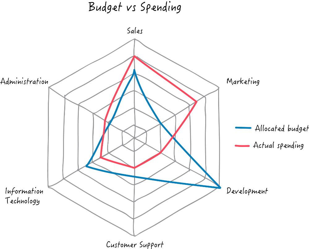
A web chart (as in spider web) or radar chart, is a two dimensional chart intended to plot one or more of a sequence of values over an axis for each variable, each axis being arranged outwardly like spokes on a wheel that radiate from a central point.
Web charts are best used for quality improvement control and to present performance metrics.
Funnel Chart
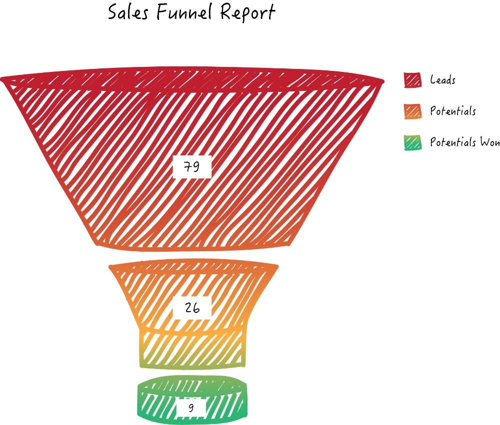
A funnel chart is a great way to represent data that progresses through stages, such as sales stages, or lead conversion phases. The sections of the funnel chart can then be used to calculate and display the total potential revenue or any other numeric values that are associated with the stages.
The funnel chart is also useful in identifying potential issues in a company's sales process, for example why you have a disproportionate number of sales in the Proposal stage.
Line Chart
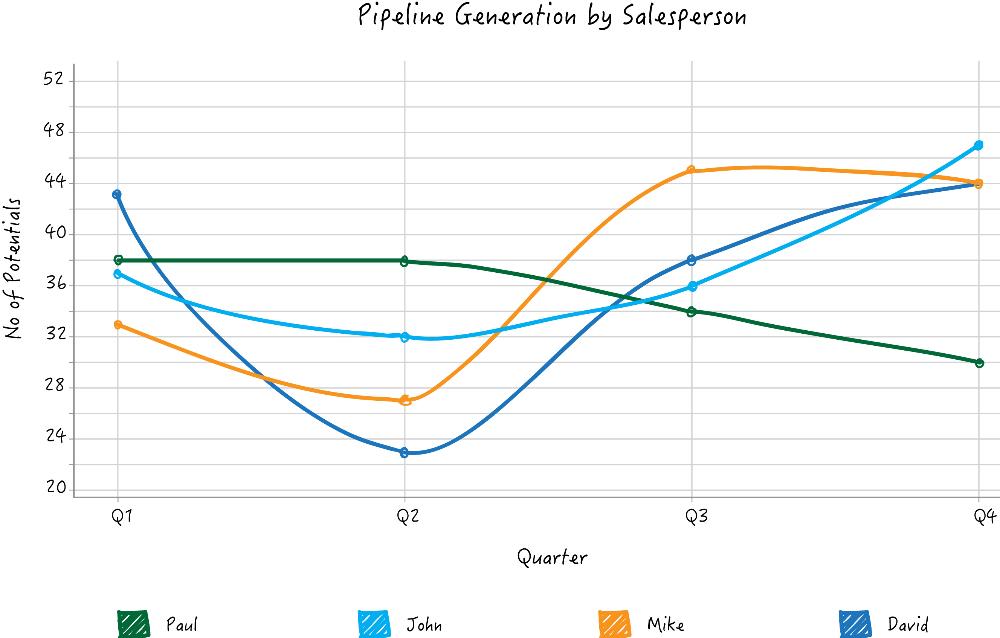
The line chart is also a very well known chart that can be used to show a series of data points connected by a line, usually showing trneds in data over time. For example, sales by month.
Scatter Chart
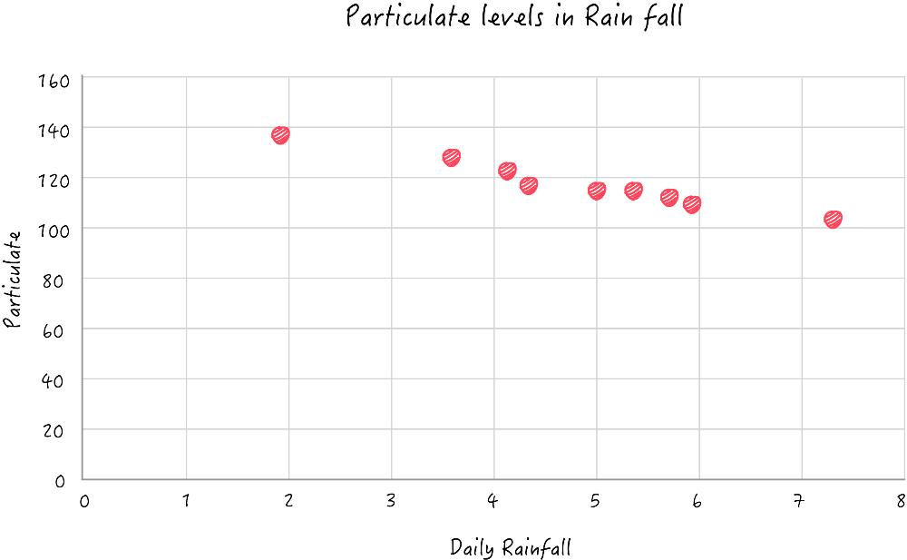
The scatter chart, at its simplest, plots data points that represent the relationship between two sets of data.
Sometimes it is not clear whether to use a scatter chart or a line chart, especially if the scatter chart contains a line. However, as a rule of thumb, a scatter chart would be used of the data is only numeric and a line chart can be used if one of the sets of data contains a non numeric data, such as month.
Area Chart
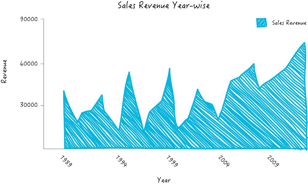
Area charts look very similar to line charts in that they show a series of data over time. The difference is that the are below the line is filled in and each data point area has a different colour. An area chart can make it easier to quickly identify data size over time.
Stacked Area Chart
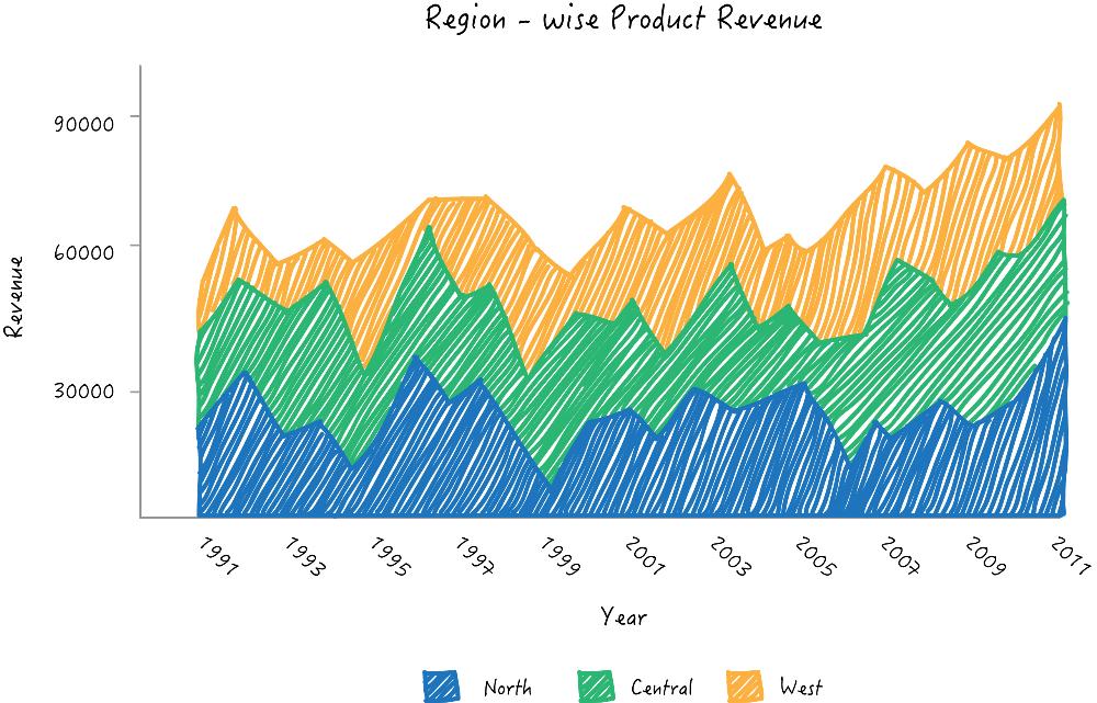
The stacked area chart is very similar to an area chart - as with the stacked bar chart and standard bar chart - however in the stacked area chart the data is displayed on top of each other, again using different colours in the area below the line.
Why Use Charts to Represent Your Business Data?
Most CRM systems will generate reports but often the hard work it takes to get the data into the system is not fully rewarded when confronted by reems of data, columns and numbers that are present in a set of reports.
With an online BI solution such as Zoho Reports you can synch your CRM software to a powerful business reporting tool to provide a complete range of illustrative charts that will help you get a better understanding of the data you want to analyse.
Contact Us
Contact us for more information and ideas on how Zoho can be implemented in your business.